


Two opals cut from the same parcel, both 9 by 7 millimetre ovals, can leave the bench looking like strangers. Set one with its flash turned toward the wearer and it lights up every time she lifts her hand. Set the other the same way but rotate it ninety degrees and it goes quiet under indoor light. The stone didn't change. The setting did. That is the whole craft in miniature: good designers don't simply hold an opal, they aim it.
Play-of-colour is not a flat surface effect. It comes from light bending through stacked layers of silica spheres inside the stone, and it arrives at your eye from specific directions. Move the opal two centimetres and the reds can vanish, replaced by greens. Move it two degrees and they come back. Everything in a modern setting — the prong placement, the wall height, the metal behind the stone, the way a pendant hangs — either respects that geometry or fights it.
Finding the Stone's Front Before the Metal Exists
The first job is to decide which face of the opal is the "front", and it is rarely simply the top of the dome. Designers roll the stone slowly under a lamp, then under a window, watching where the brightest flash sits and how wide the cone of strong colour is. Some stones have a generous sweet spot that reads from almost any angle. Others are fussy: brilliant from one viewpoint, dull from all others.
A few habits worth borrowing:
- Place the stone on matte black card and move the light in a slow arc rather than moving the stone. You will see the sweet spot travel.
- Check it at the distance you will actually view it. A ring is seen from 30 to 50 centimetres away, a pendant from across a table.
- Mark the orientation with a strip of tape on the girdle or a pencil dot on the back — not on the polished face.
- Test it in daylight and in warm indoor light. A stone chosen only under a jeweller's lamp can disappoint at home.
There is a trade-off here that never goes away. Rotating a stone for maximum brightness sometimes costs you pattern, and rotating for pattern can dull the flash. Designers usually choose brightness and let the pattern be a bonus. Buyers who fall for a harlequin flagstone often disagree, which is why the choice belongs to whoever will wear it.
Framing the Flash: Bezel, Prong and the Space Between
A bezel is the most protective choice and, for opals, protection matters. Opal sits around 5.5 to 6.5 on the Mohs scale and a sharp knock can craze it. But a tall, heavy wall shadows the edges of the stone, and on a small opal that wall can eat a fifth of the visible colour. Contemporary bezels tend to be thin at the rim, sometimes tapered inward, with a polished interior that bounces light back across the dome instead of absorbing it.
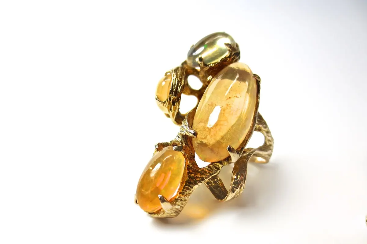
Prong work gives more open face and lets the stone sit lower in the eye. The rule is blunt: no prong over the flash. If the sweet spot lives at the upper left of a cabochon, put a claw at the lower right and at the shoulders, and leave the bright quadrant clear. On rectangular stones, corner prongs read as deliberate; on rounds, four claws at the diagonals are kinder than six claws crowding the dome.
Why Low Beats High
People look down at their hands. A low-set opal catches ceiling and daylight from above, which is the angle it will be seen from most often. A high crown may photograph beautifully and then spend its life in shadow. Low settings also survive door frames, car doors and toddlers, which is not a small consideration for a stone that dislikes impact.
Metal Is a Reflector, Not Just a Frame
Yellow gold warms a white opal and can flatter a stone with honey body tone. It can also muddy a pale crystal opal that needs cool light. White metals are neutral and safe, though a very light opal in bright white gold can look washed out. Rose gold sits in between and suits stones with pink or copper flashes.
The more interesting decision is what sits behind the stone. A dark backing — oxidised silver, blackened gold, even a recessed cavity painted matte black — deepens body tone and pushes colour forward, the same trick as a black velvet tray. A bright polished backing lifts a translucent crystal opal. For crystal and white opals, an open back lets daylight pass through and is often the whole point; for solid black opal, transmitted light adds nothing and a closed, darkened back does more.
Ask the maker what the stone is sitting on, not only what it is wrapped in. The backing is half the design.
Contemporary Moves Worth Knowing
Modern settings play with orientation and movement rather than ornament. A few approaches that show up again and again:
- Off-axis frames. A round opal set at a slight rotation inside a square or rectangular frame, so the sweet spot faces the wearer rather than the ceiling.
- Asymmetric shoulders. One side open, one side solid, shifting the visual weight toward the flash and letting the stone tilt a few degrees forward.
- Open galleries and cut-out backs. Less metal, less weight, more light reaching the pavilion.
- Rotated clusters. Several small opals turned so that when one rests, another catches — colour that alternates as the hand moves.
- Articulation. Hinged links or a swinging bail that keeps the stone square to the light as the wrist or neck turns.
Holding the Angle When the Piece Moves
A pendant that spins is a pendant half the time. Designers counter this with a bail placed slightly off centre, a hidden loop at the back, or a small counterweight so the front settles downward by itself. Earrings work the same way: a drop needs enough weight at the lower edge to hang face-forward, while a stud has to read from a three-quarter view because nobody looks at your ear straight on.
Rings are simpler and less forgiving. The stone faces up, the hand moves, the light changes. That is why a ring opal with a narrow sweet spot can feel disappointing while the same stone in a pendant feels alive — the pendant stays oriented, the ring does not.
Checking a Piece Before You Commit
Whether you are commissioning or choosing from a case, a handful of questions will tell you whether the setting was designed or just assembled. Ask to see the piece under a window and under a warm bulb. Look at it from the distance you will wear it. Check that no prong, bail or decorative element covers the brightest area. Turn your hand or tilt your head and see how quickly the colour drops away. Ask what the backing is made of, and whether the opal is solid, a doublet or a triplet — the answer affects both value and care.
Living With a Colour-Play Piece
An opal set this carefully deserves reasonable treatment. Keep it away from heat, harsh chemicals and ultrasonic cleaners unless the maker confirms it is safe; doublets and triplets in particular need gentler handling than solid stone, so ask rather than assume. Store it separately from harder jewellery, since diamond and sapphire will scratch an opal without trying. Have prongs and bezel edges checked once a year — a loose stone is a chipped stone waiting to happen.
And expect the colour to change. The opal that thrilled you in the shop will look different in a north-facing kitchen and different again at dusk. That is not a flaw in the setting. It is the reason the setting was designed the way it was: to make sure the best of that shifting colour keeps arriving at your eye, from the angle you actually live at.
Photo: sarakgraves / Pixabay